What does it take to completely revamp Second Life® as an immersive platform that has little or nothing to do with the environments we’re used to see all around us? Well, the answer by Damien Fate and Washu Zebrastripe seems to be: not much, except for a lot of creativity and a huge amount of detailed, professional work.
So bear with me in this journey across the redefinition of what our favourite virtual world platform can magically do, if you just put enough work, love, and creativity into it!…
The arrival
 Damien and Washu are over-5-year-old veterans of Second Life. They have done dramatic things as part of their work here — from the most astonishing scenarios and props for CSI:NY, launching the Mirada air brand, running the Hairspray sim, and doing a lot of professional work for Beta Technologies as well (Washu is our Creative Assistant and orders her hubby around 😉 ). So I’m constantly surrounded by their talent and creativity, and always amazed on how that pair can work so hard for so many hours per day, and still meet all their deadlines, and excel in everything they do. Everything they do in Second Life has this amazing “WOW!” factor, so I was only expecting the best from them.
Of course, nothing could really prepare me for what I found on the Loco Pocos Island 🙂
The arrival is on a delightfully cartoonish setting, and suddenly you’re out of the almost-photo-realistic look of most of the builds in Second Life (well, at least the ones that are well built, of course!) and drop into a scenario that could have been created by Disney, Pixar, or a Japanese company. It’s all so cute and cartoonish!… but at the same time, incredibly detailed, with the amazingly detailed sculpties and light effects that only Damien Fate can create.
Once your breath has been taken away with the view (“Oh my God, it’s a GIANT TREE!!”) it’s time to step into the main store.
The shop
 Both Damien and Washu are not exactly newcomers to shopping in Second Life. Since the old Mirada days in the mainland, to their own sim at Hairspray, and to designing shops for both SL and RL clients, they have a pretty thorough knowledge on how a shop should look like in SL. For instance, from the Loco Pocos tinycam view, the shop seems huge… but that’s ok, since when a visitor first comes in, they’ll have a normal sized avatar, so the shop has to be easy to navigate!
The second issue is the detail in packaging and presentation. The avatars and accessories come inside little cute toy boxes — how appropriate! But there is a nice trick: before you can buy them, you can try clicking on buttons to preview the colours (and some effects) on each item. Very neat! Damien promises to release new items every week or so. A few, however, will be available as special and unique items that you can get only through solving puzzles…
The environment at Loco Pocos Island
Here is where the fun begins! The first generation of Tiny Avatars happened by chance and surprise, a shop start selling them in an obscure and remote part of the grid. It took some time (but not much!) until creators resized all their items, re-packaged them, and sold them at the “appropriate” size. This happened rather quickly, but then the question was: what to do with your tiny avatars? They couldn’t even sit on properly sized (ie. human sized) chairs, and there were no locations available to enjoy the pleasures of being a tiny. That came, in due time, while the fashion lasted.
 Damien and Washu planned the environment for Loco Pocos avatars from the very beginning. Since all is supposed to be cute-y and fun, by starting to collect the journals scattered around the island, a story unfolds. A story of mystery, challenges, and adventures — and each of them leads to a puzzle, and finding the solution will give you a prize. Thanks to Ana Lutetia, who, as a former Girl Scout, has a keen sense of orientation, we managed to find the hidden treasure in a huge labyrinth with sand funnels and other obstacles — and got a cute bag full of shiny crystals and gold coins!
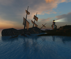
 I won’t tell you about the other puzzle. Damien calls them “dreams”. Some involve pirate ships and volcanos and hidden forests… and he’s planning to add a few more. As the story about Loco Pocos unfolds, more and more areas get opened in the sim, all with dazzling colours and shiny details, all with an intense aura of Disneyesque atmosphere… something that really needs to be experienced, since the pictures, no matter how good they look, cannot convey the feelings involved in exploring the whole place.
The future?
What Damien and Washu really want is to make sure people have a lot of fun with their Loco Pocos, and recapture a bit of the magic that Second Life has to offer. If they can also make a return on their investment (several months of creating the island, the Loco Pocos avatars and their assortment of accessories, animations, and special effects, paying the translators to get all information in seven different languages, and, of course, the tier for the island), they’ll be more than happy! And Loco Pocos are cheap: L$350 (less than one Euro!) will get you one of those cuties, and each accessory just costs L$100. A bargain, for the insane detail put into those!
Loco Pocos are not “yet another tiny avatar” brand. According to Damien, almost all avatars are based on an original special animation to deform them (and fold the normal avatar mesh upon itself) and a few open source scripts. A major disadvantage of those is that for instance you cannot sit on a normal chair using a standard tiny avatar. They need special chairs. They don’t move their wrists. They have several limitations on how detailed their movements can be. Damien corrected all that, and although Loco Pocos are 10 cm taller than “standard tiny avatars”, they can do quite a lot of things that tinies can’t. But the best part is definitely the HUD.
Damien’s attempts at HUDs are not new. We all know how tough it is to use Gestures; some recent research in SL, done by a Portuguese scientist, showed that people in SL rarely use them. They’re so hard to configure! I have over two hundred Gestures and I can definitely understand that; compare that with IMVU, There.com, or any other popular virtual world, where “emotes” are easy to use, just a click away, and easy to add as well.
The Loco Pocos HUD does that and much more. You can click on your Loco Pocos, and the HUD will switch to a configuration display, where you can change things like the shape and colour of your nose and whiskers, the texturing, or the colour. Click on an attachment — clothes are attachments too — and your Loco Pocos HUD will now allow you to change options for your attachment as well. That’s it — so easy. All with tiny icons and no words: Damien wants an open, international experience, since over 60% of all SL users don’t speak a word of English, and they shouldn’t be excluded from enjoying their Loco Pocos! So not only the whole island is multilingual, but you can use your Loco Pocos just by pointing and clicking on cute icons, which should be obvious enough. If not, you should just experiment clicking on them and see what happens! The “emotes” (they’re far more than Gestures, since they add special effects with 3D particles and textures — something that not even IMVU has!) are insanely adorable and cute, and the only thing that you wish is that you had more of them available!
In an unspecified future, Damien will probably release the API that allows easy integration with the HUD, so other creators and designers will be able to build their on Loco Pocos-compatible creations. For now, however, this is Damien and Washu’s personal project.
A realm of magic and dreaming, in an alternative Second Life, done so well and correctly, working so easily and user-friendly, that I can only hope that Linden Lab’s interface design team takes a look at it and gets some inspiration to improve the clunky SL interface…
While we wait for that, we still can enjoy Loco Pocos, and dream together with Damien and Washu 🙂
More info can be found on the official Loco Pocos website.


